Körperteile
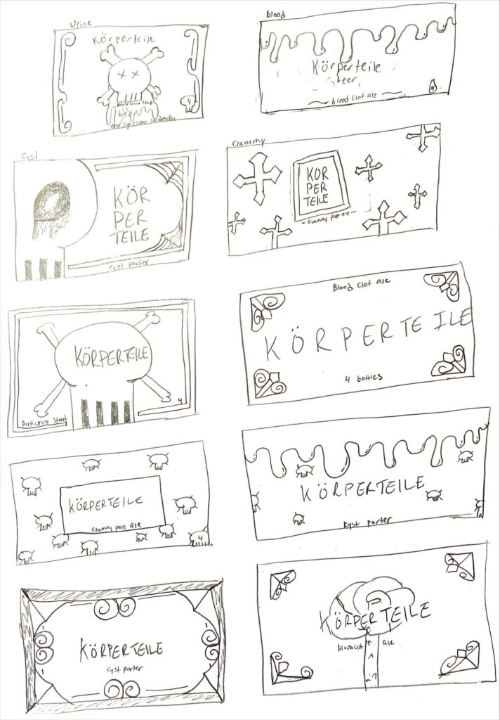
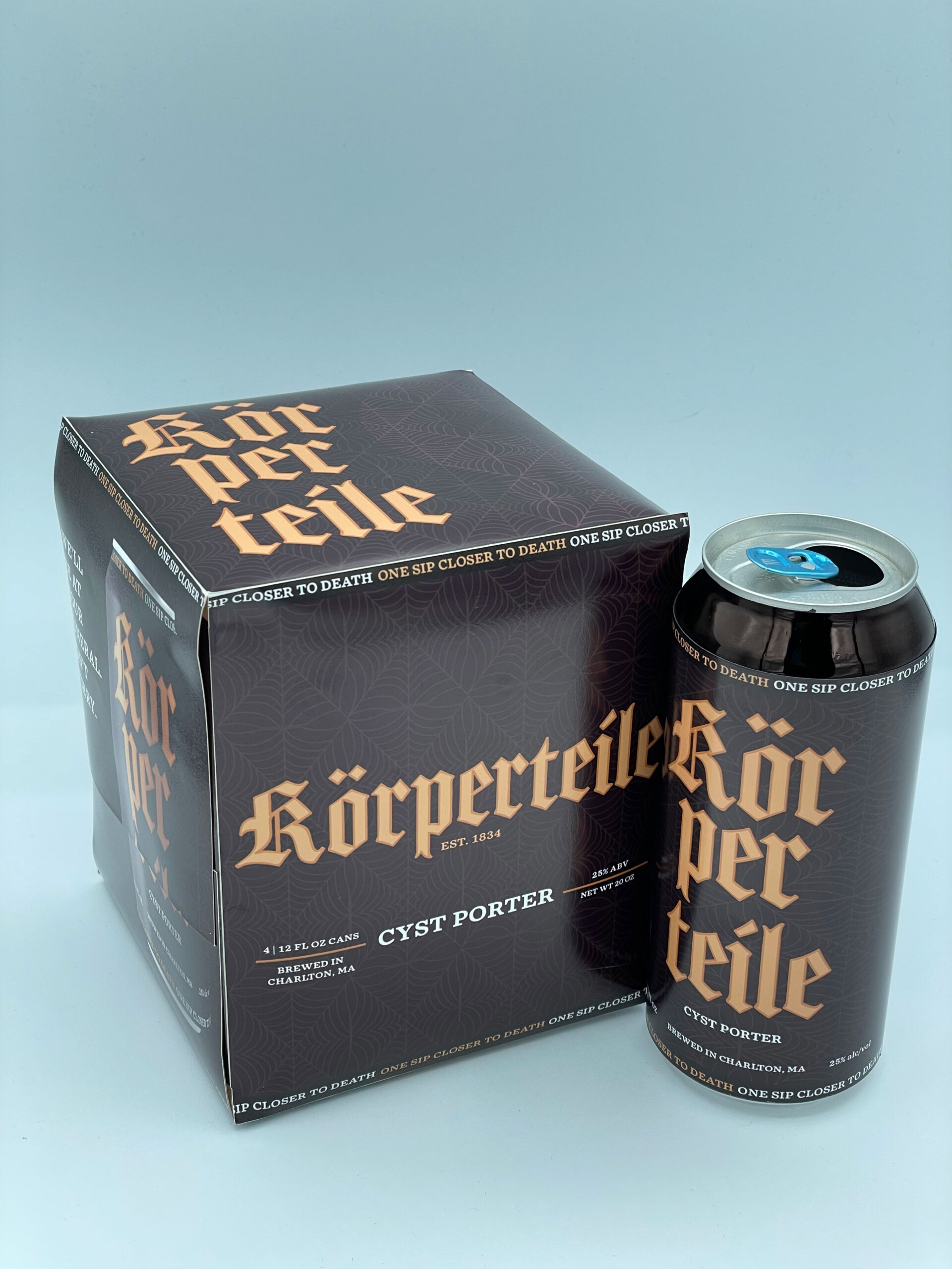
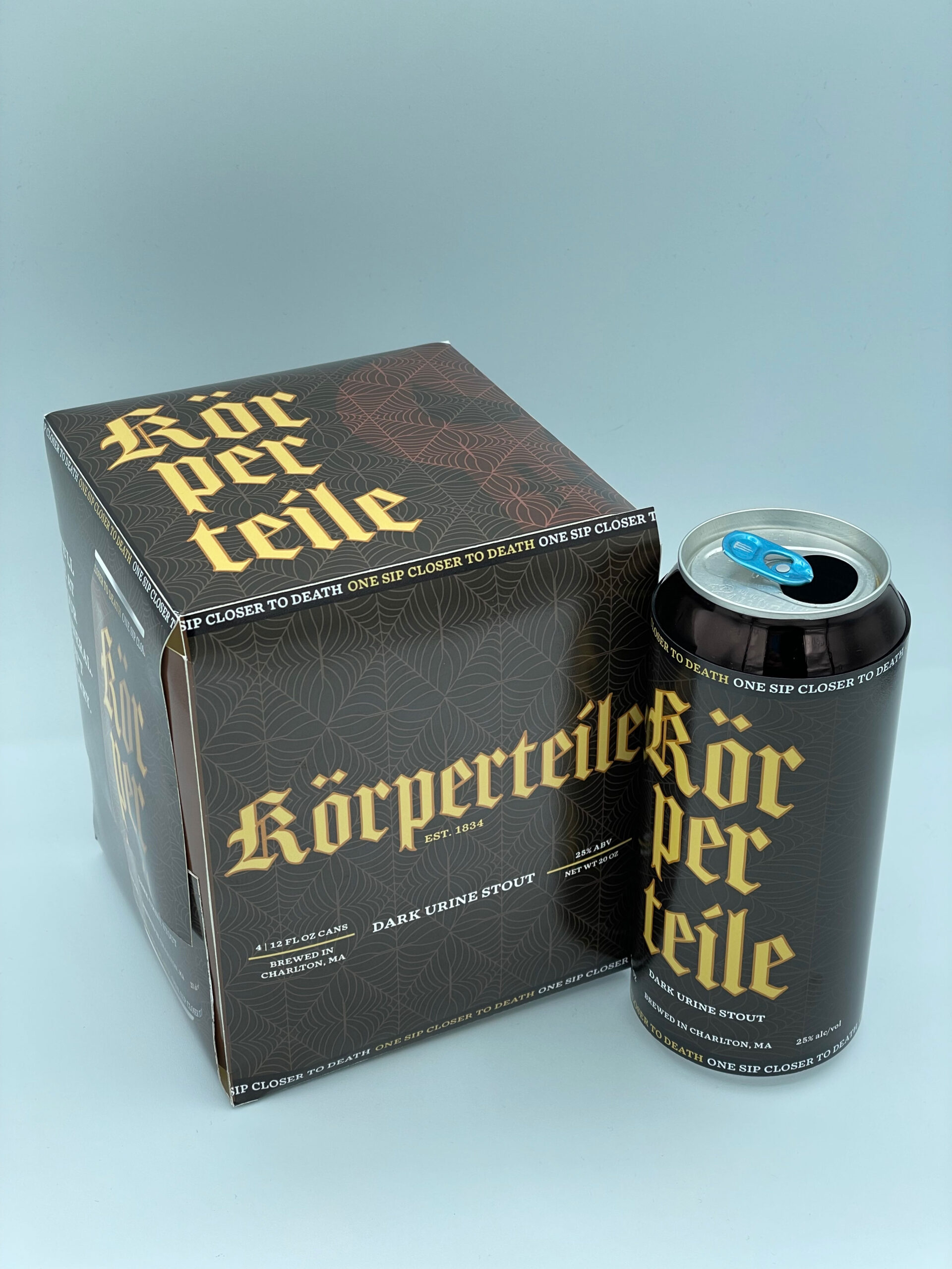
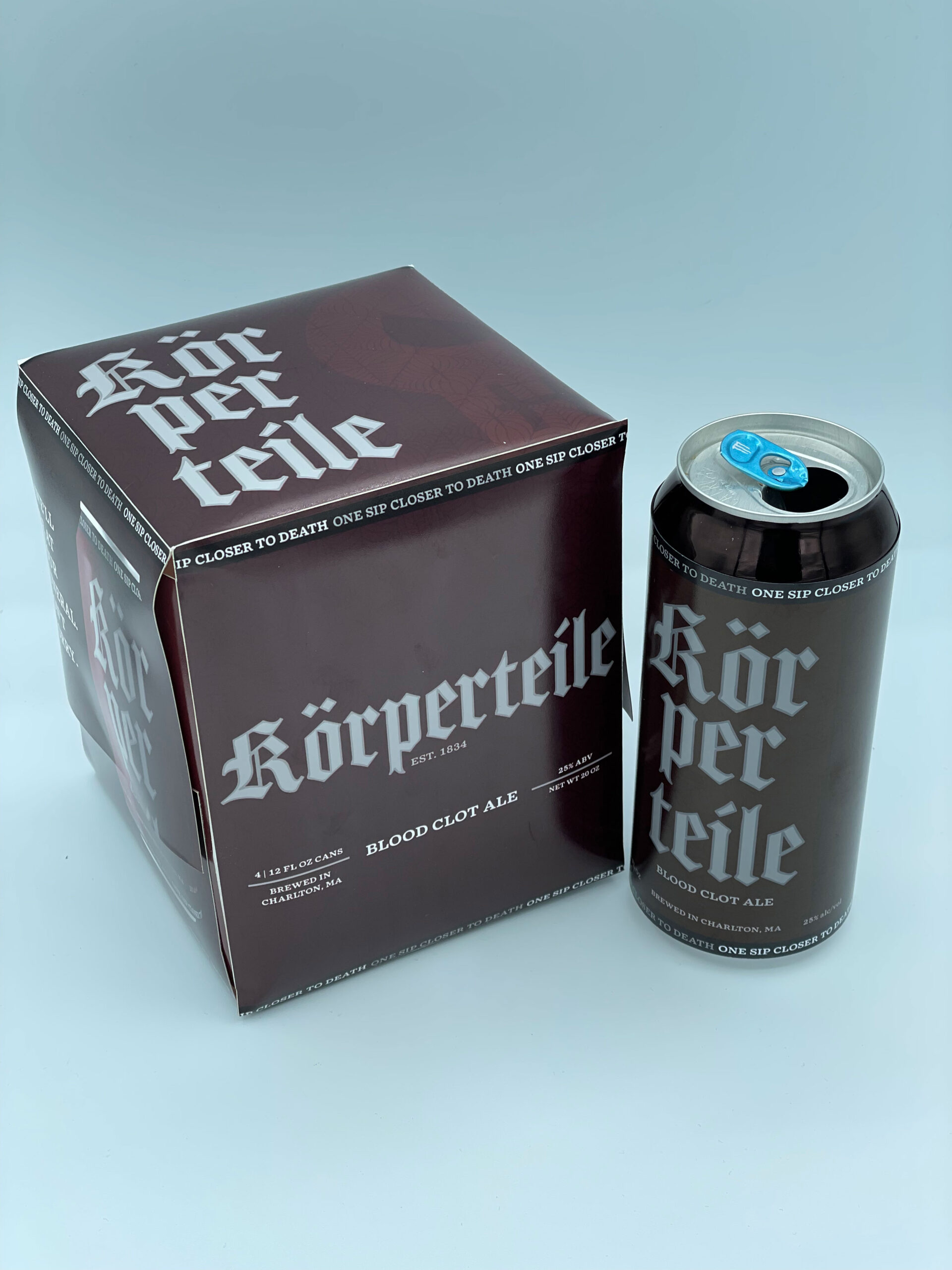
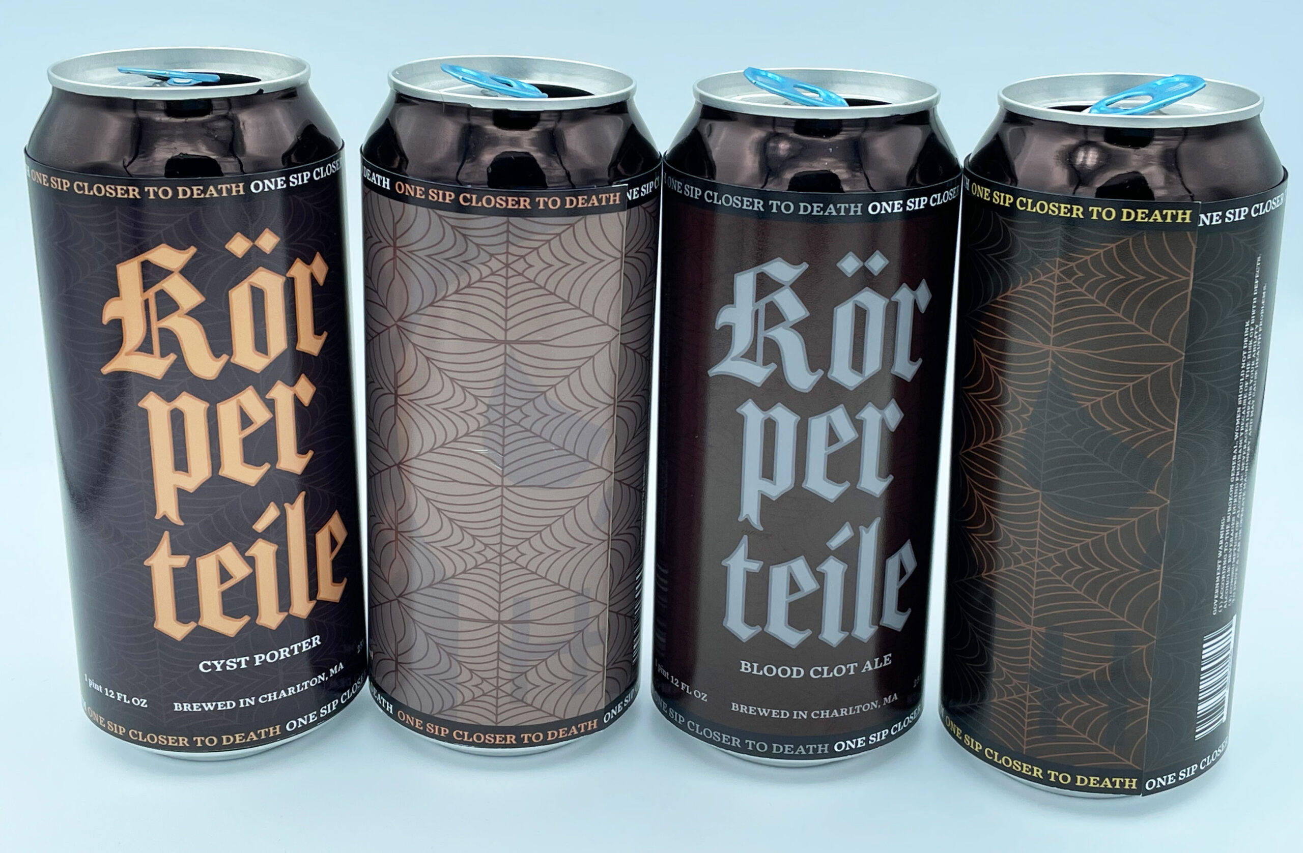
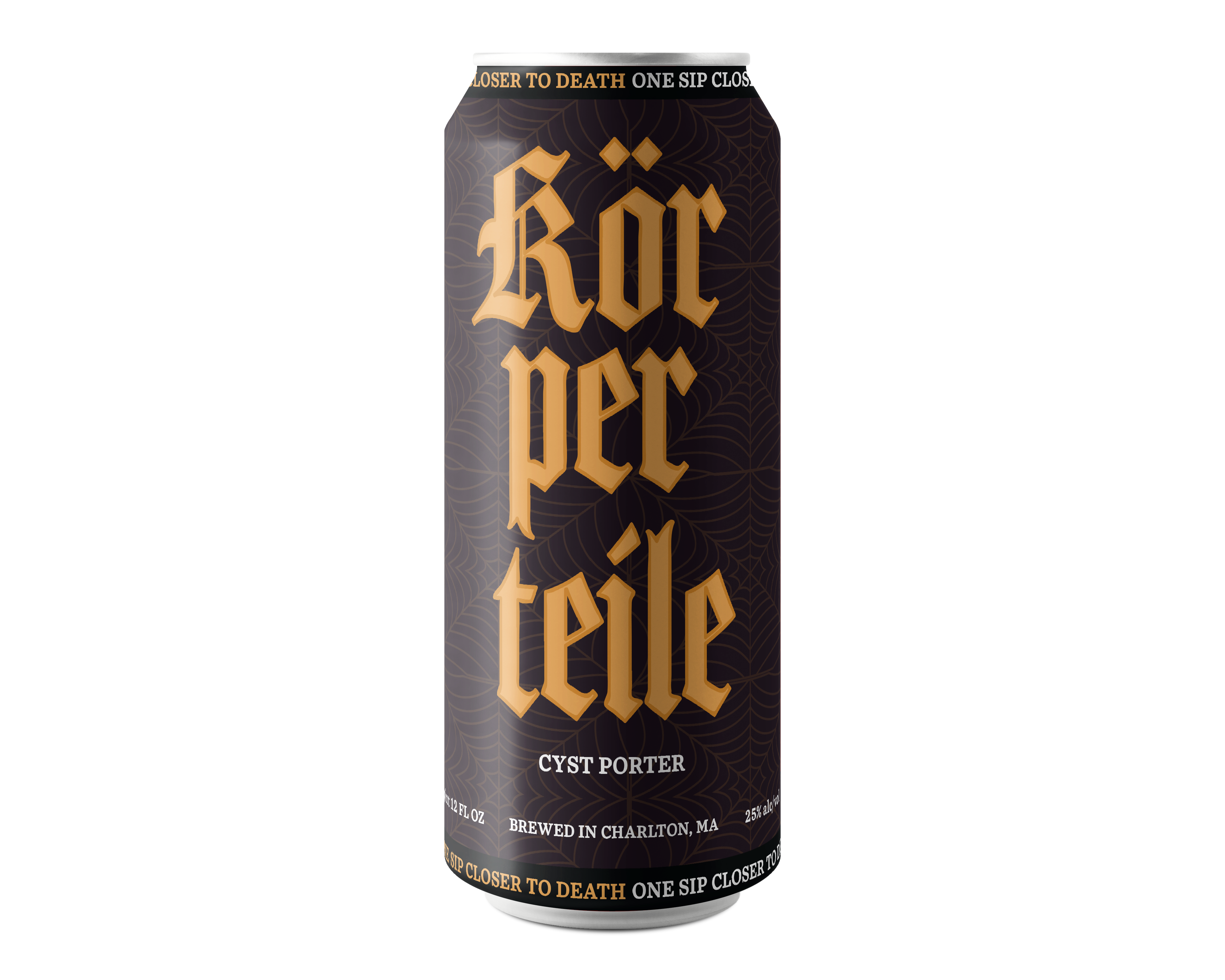
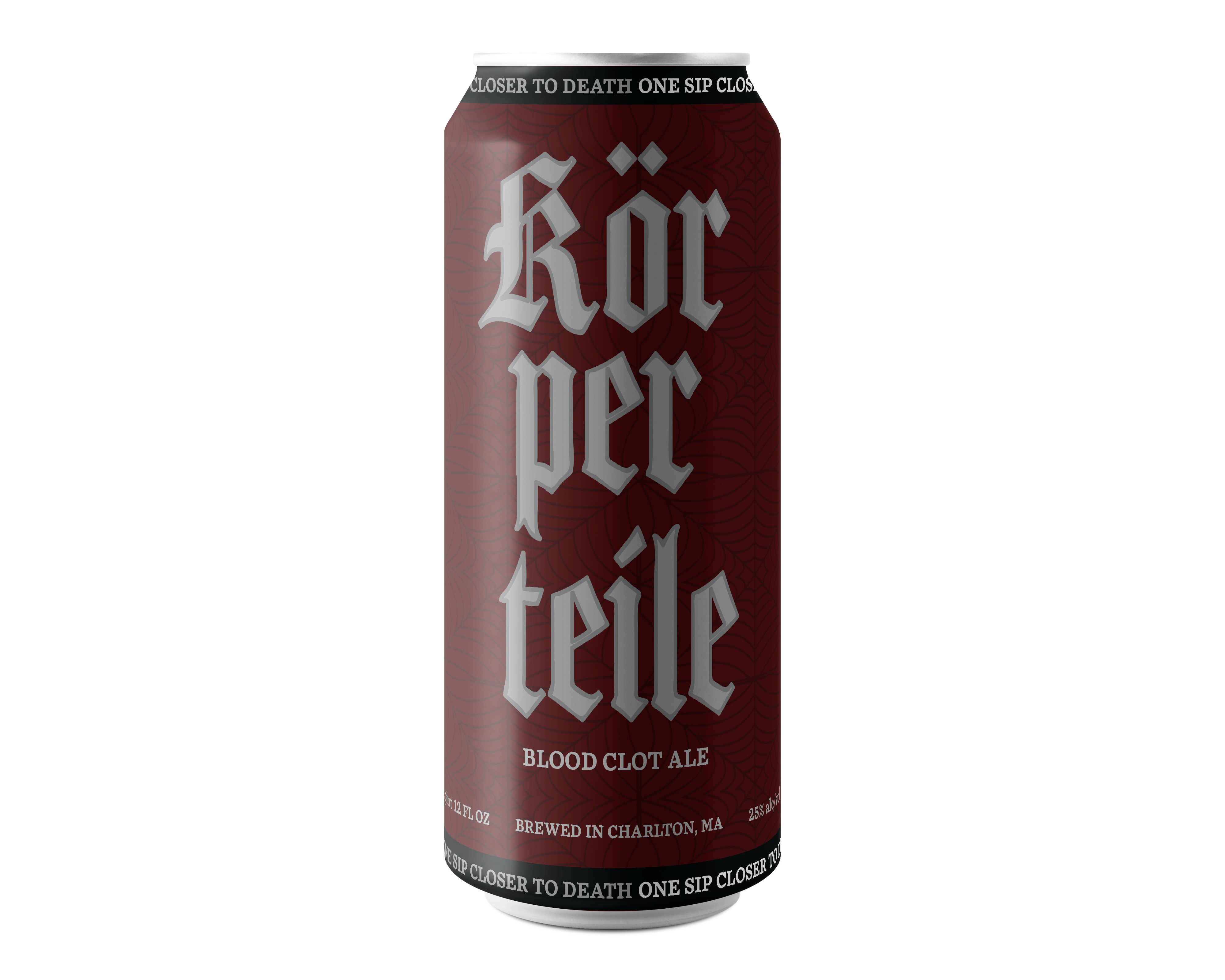
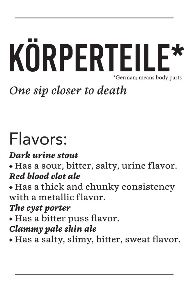
Körperteile came about from being a concept that was assigned as a project during the school semester. I was tasked with creating a parody brand where the product was beer and the region was North-Eastern America. I had to design four different flavors while making the brand look real until on inspection that it is not a real brand but a parody. Through loads of initial and deeper research on the region and beer, it was time to sketch.
I wanted to focus on the effects alcohol has on your body when you drink it in general and excessively. I want those who inspect this package to think about their consumption of alcohol and evaluate its worth or not it takes on their body and life. So the direction I knew I wanted to go down was a dark and sarcastic manner. So I sketched ideas based on this and landed on a Gothic style to capture the gross and gritty nature of the effects of drinking alcohol. As sketching progressed, I kept going towards skulls and things that represented death. This can be the end result when the body’s functions start to fail in due time from excessive drinking and other factors along with it.
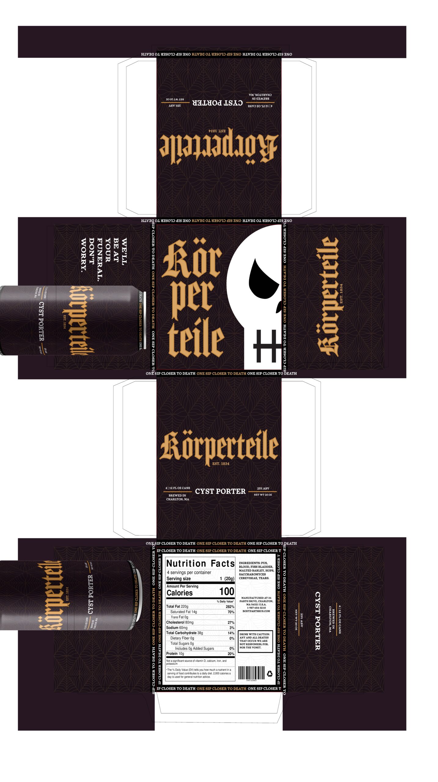
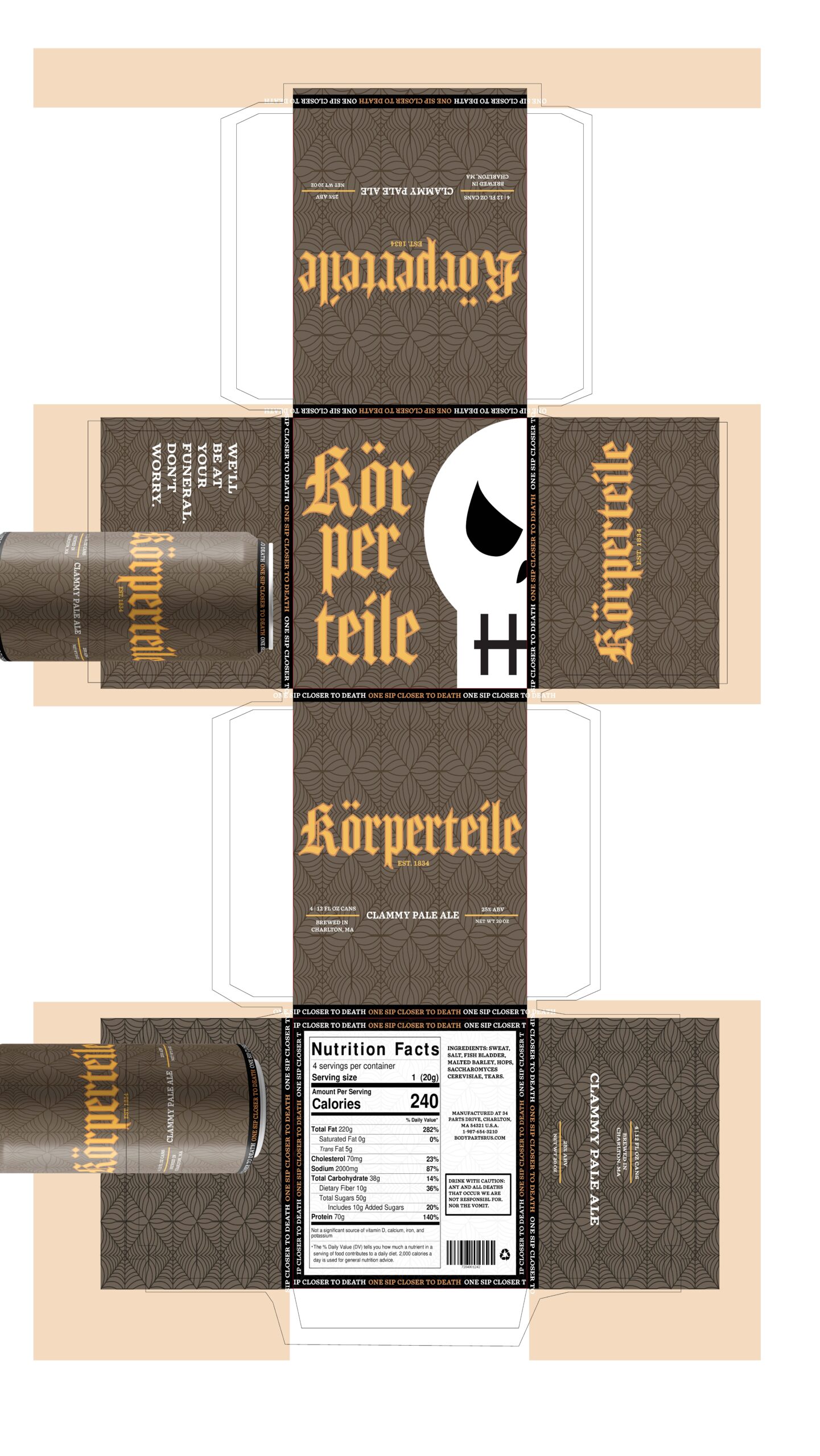
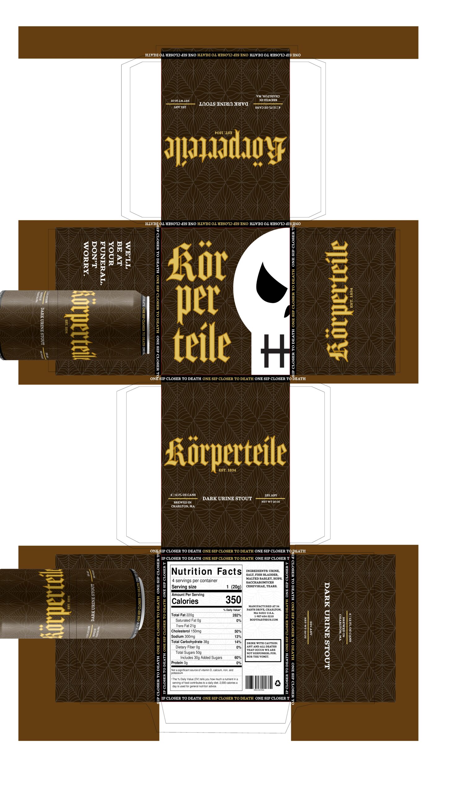
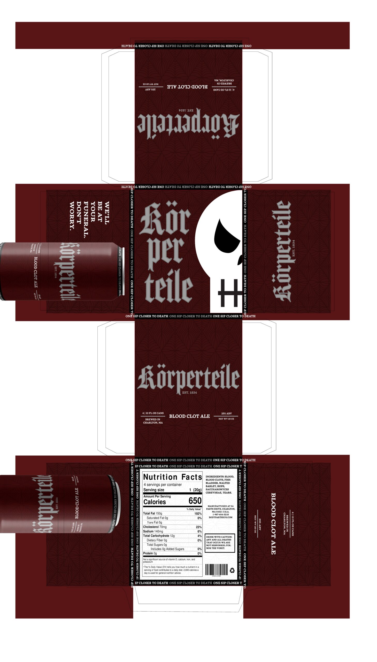
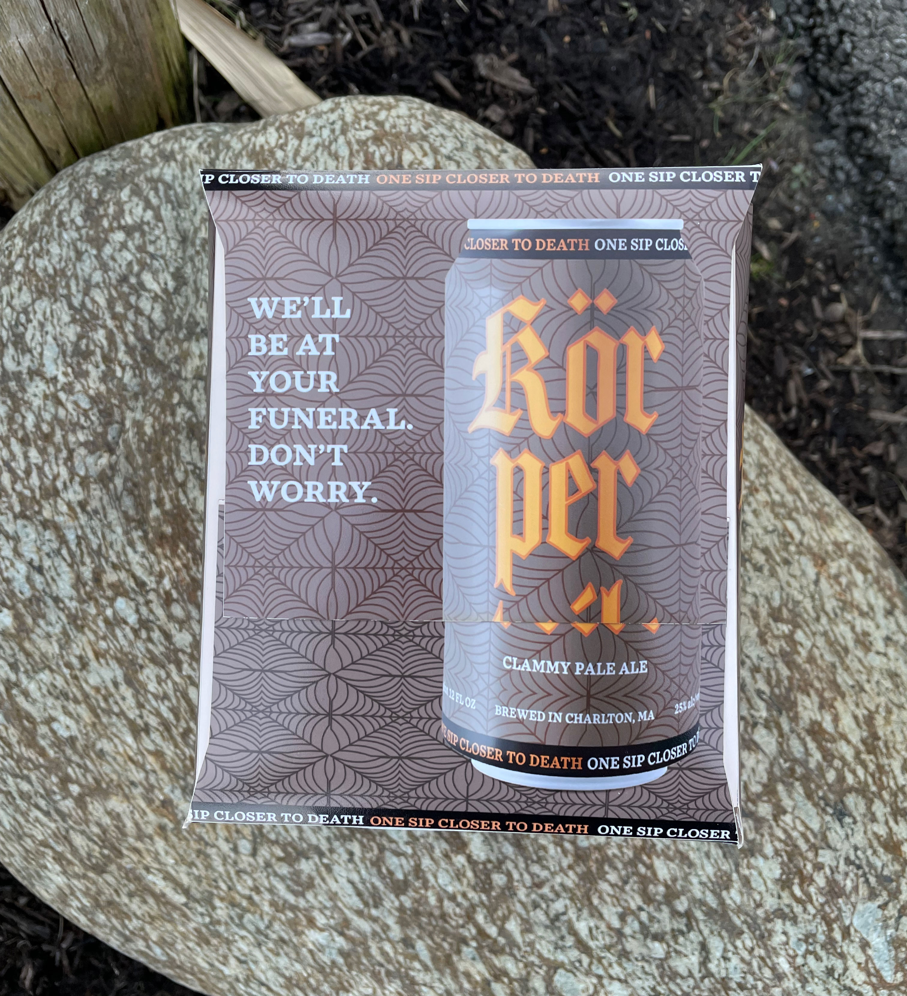
I experimented with many different looks for this brand but knew I wanted the cobweb pattern that you see now to be the focus on giving that Gothic feeling. This is where the brand design all started. As I experimented and messed around with the look I wanted to incorporate a skull somewhere but wasn’t satisfied until fellow classmates gave feedback on the skull’s placement and to try a different blending mode that I had not seen to try till mentioned. I graciously took this feedback and everything fell into place then (the skull is full white here so it can be seen, but it is affected by a blending mode; shown below). For the brand’s voice, I wanted to use my sarcastic humor and kept it dark since the effects are not pretty. So I had fun with the voice which is all throughout the design in large and small details. Can you find them all?
Through this experience of branding, package design, and making I learned a lot. I learned that when making a packaging model the actual size will still be different from the model you make so keeping that in mind would’ve been helpful in getting the side flaps to line up perfectly to create the full can on the side of the package. The project is a success in looking real until looked upon closely to know it’s a parody. Furthermore, the feeling and voice of the brand are as harsh and gritty as the truth of the effects alcohol has on the body.
